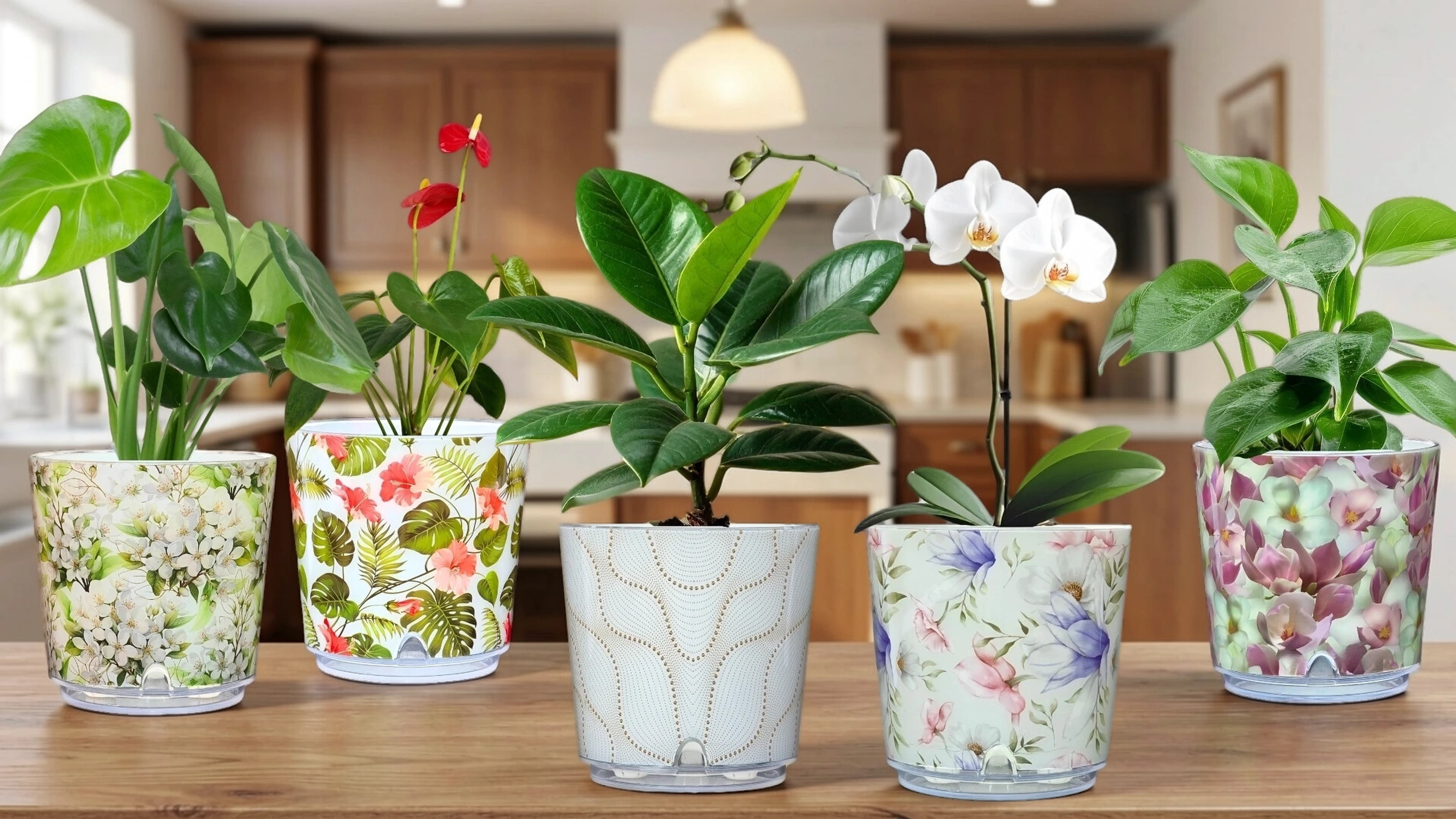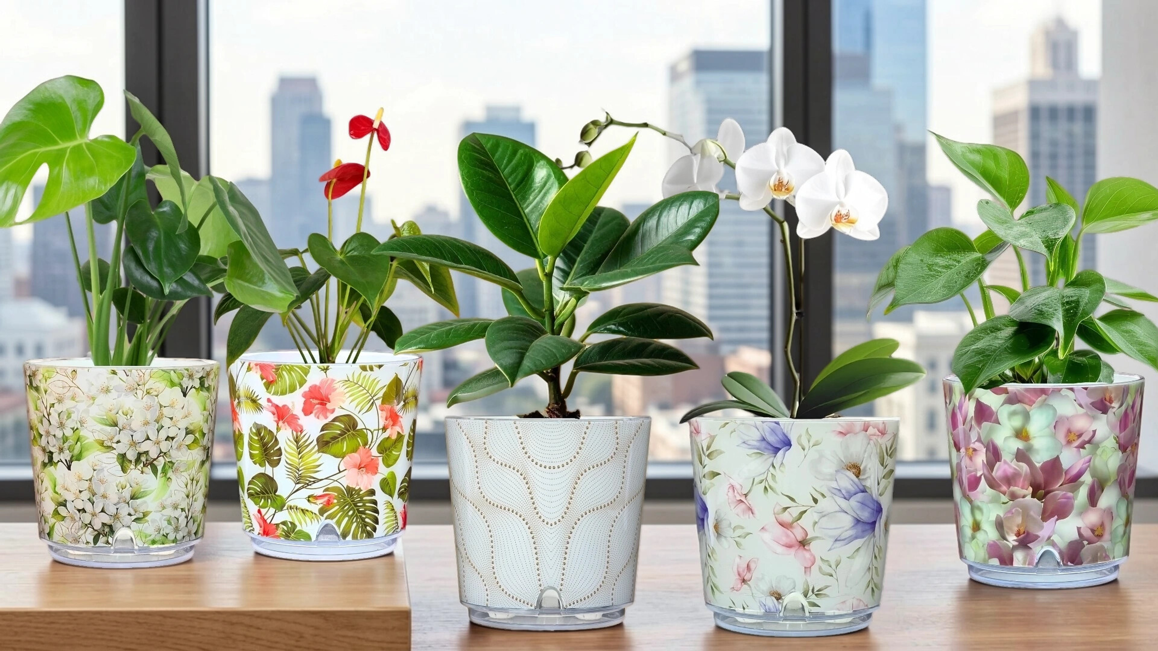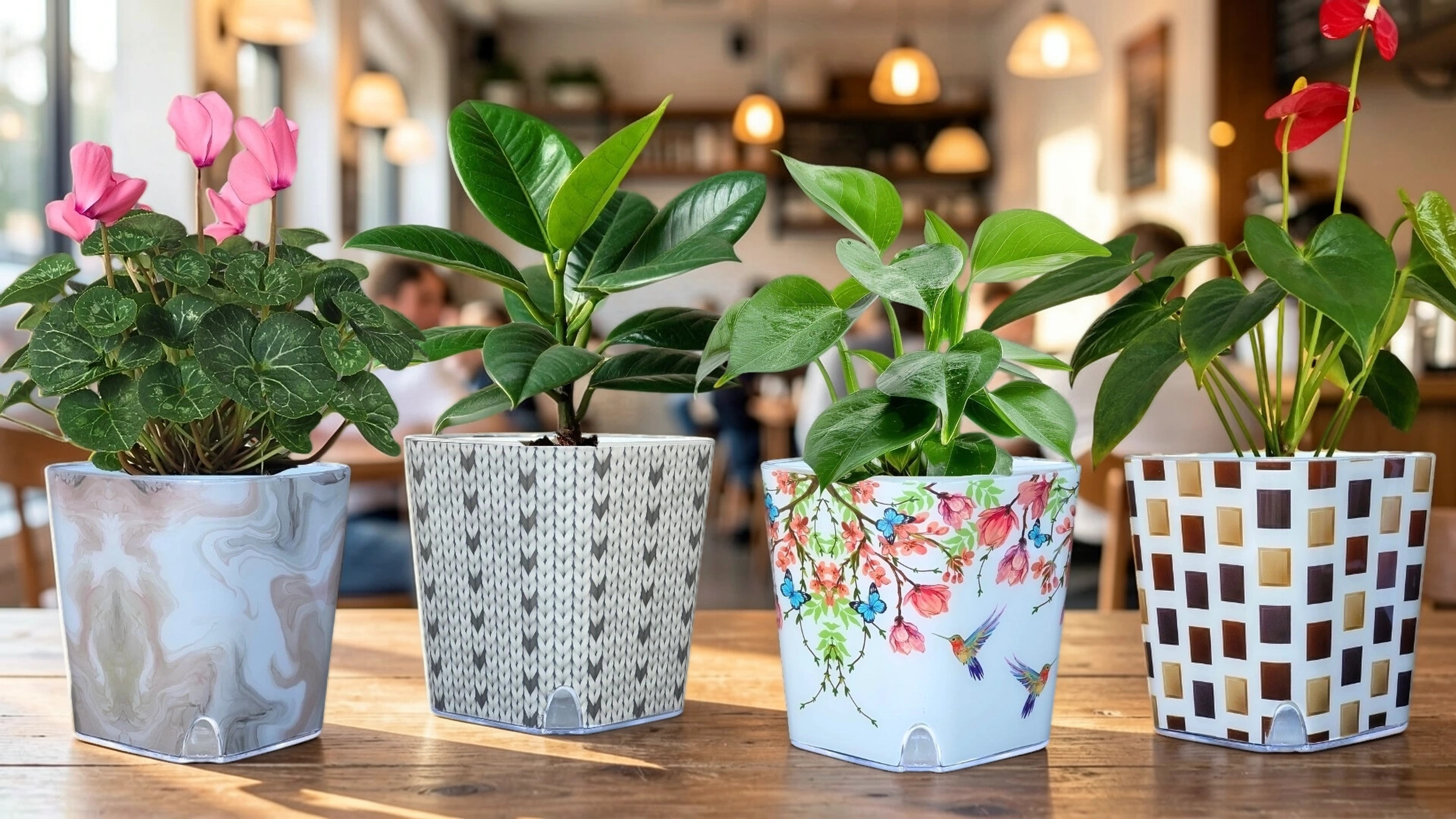
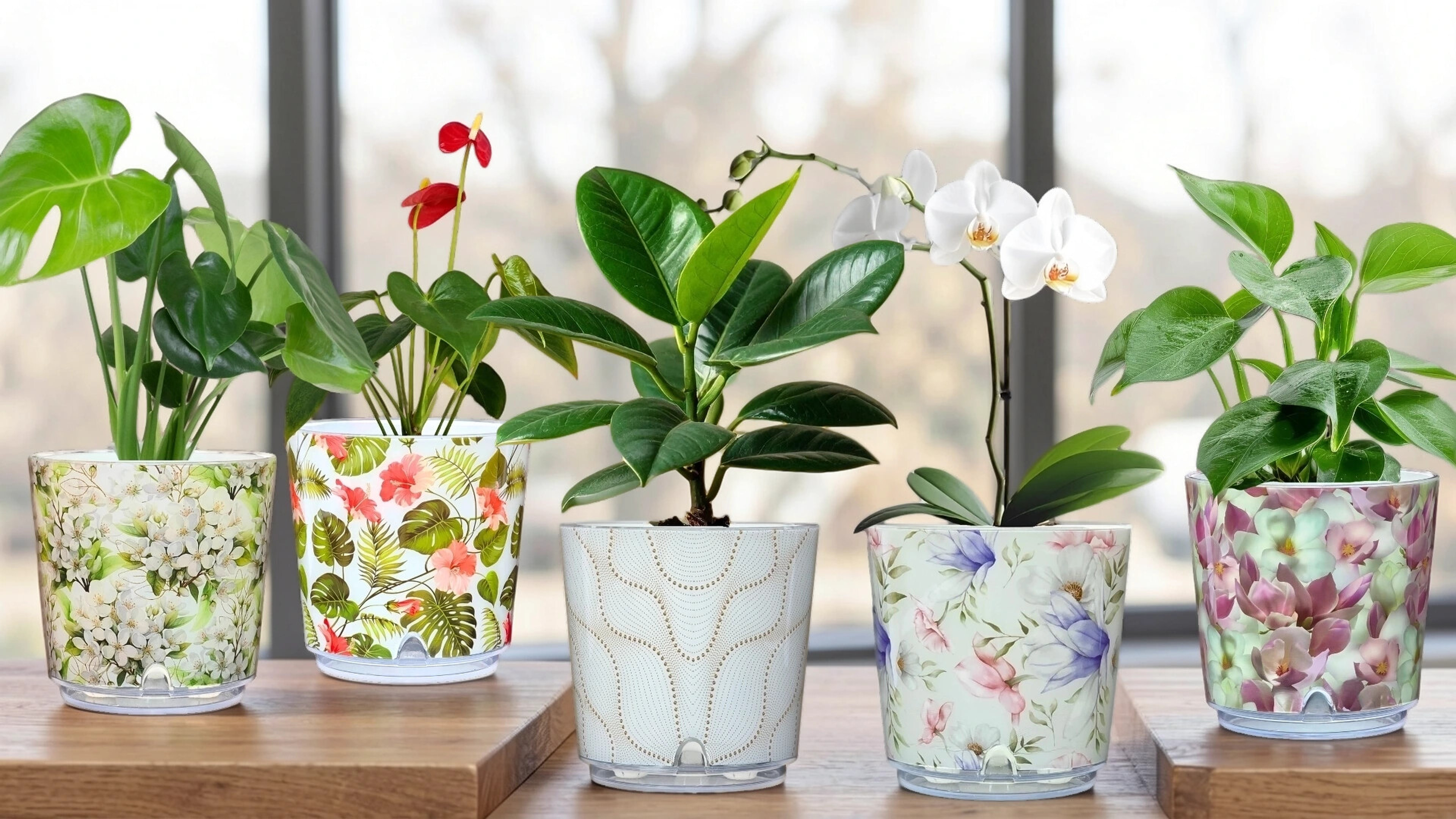
From the calm blue-and-white of Oriental to the cosy texture of Knitting, ELVE's pattern families are a design tool. Here is how to pick the right one for each room in your home.
A planter is rarely just a container — it is a small, glossy object of colour and pattern that sits in your line of sight every day. Choosing the right print is less about matching and more about mood. Each ELVE pattern family carries its own character, and the trick is pairing that character to the feeling you want a room to have.
Calm and considered
For rooms meant to feel restful — bedrooms, reading corners, a quiet bathroom shelf — lean on the softer families. Marble brings a grey-and-cream stillness, Oriental offers timeless blue-and-white porcelain motifs, and Sculptura's sculpted 3D relief adds interest through texture rather than colour. These patterns settle into a space rather than shout across it.
A pattern should belong to the room, not compete with it.
ELVE Journal
Warm and expressive
Living rooms and kitchens can carry more personality. Botanica's botanical and ivy prints echo the greenery they hold, Tropica brings blossom, butterflies and hummingbirds to a sunny sill, and Geometria's gilded geometric dots add a confident, contemporary edge. For cosier, more tactile schemes, Boho's earthy bohemian look and the soft Knitting texture feel instantly at home.
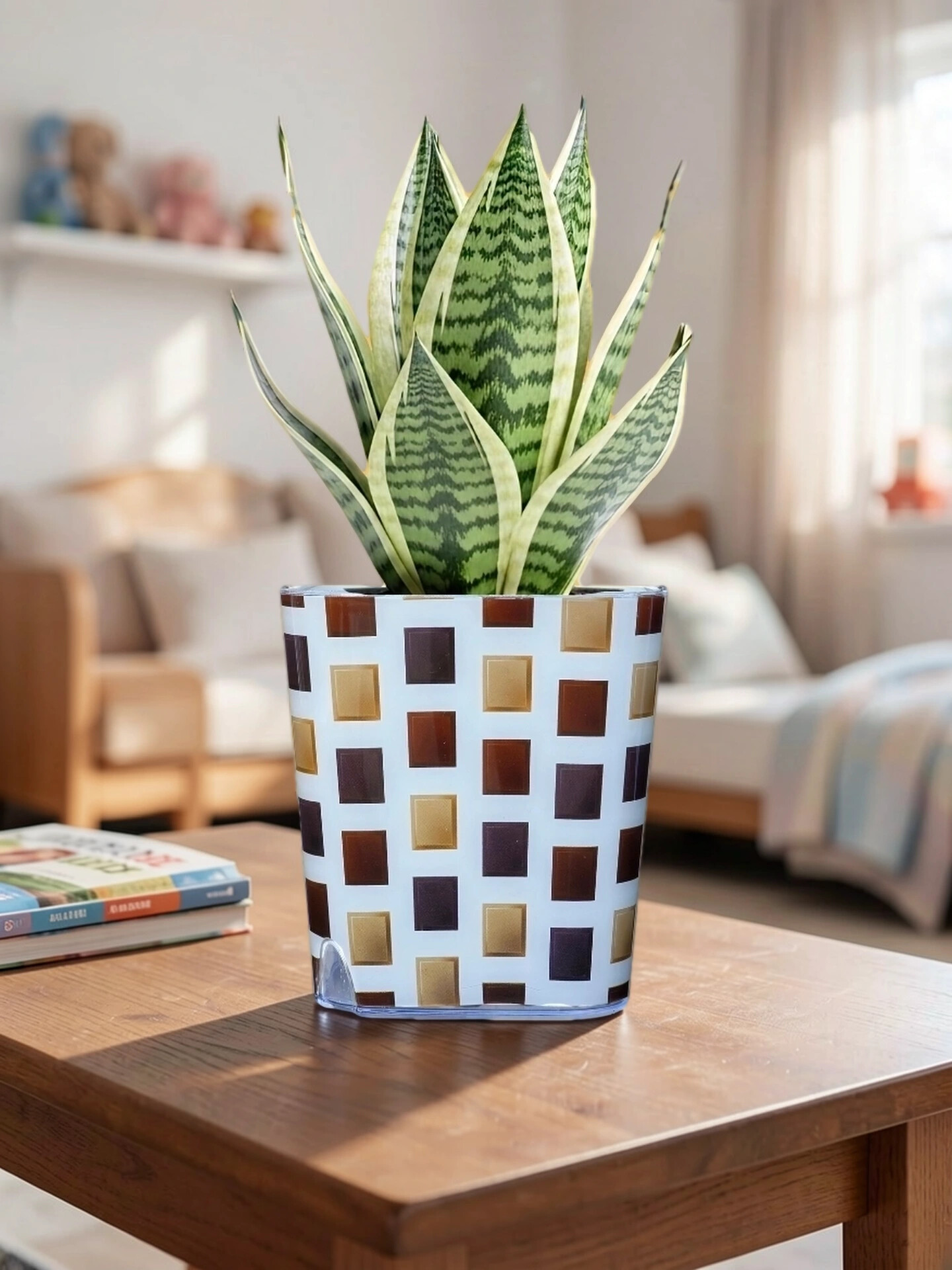
One simple rule keeps a home feeling coherent: let one pattern family lead in each room, and repeat it rather than mixing many prints at once. A trio of matching planters reads as a deliberate design choice, while a scattering of unrelated patterns can feel accidental.